Background
Cargo — a design system used by Tradeling, that serves as a single source of truth for designers and developers.
Styles and UI components are created in Figma, frontend based on TailwingCSS. Cargo supports responsive Web and iOS/Android App platforms.
Business goal
Achieve improved operational efficiency, accelerated product design and development, enhanced cost-effectiveness.
Cargo is an standalone product where designers are stakeholders.
Success metric
Speedup design process, decision making, frontend handover time by ay least 30%.
Designers now spend time on creating experiences, rather than moving around forms and buttons.
My role
As a co-creator and one of the stakeholders of Cargo design system, I have been contributing to and maintaining the component library for 1.5 years.
I have created more than 30 new components and updated most of existing ones.
Challenges
- Multiple component libraries, not connected by common style library.
- Designers using outdated components from different libraries, resulting in inconsistency of UI.
- No documentation for designers on how to work with a design system.
- Engineers and business are not aware of importance of a design system.
- Unclear processes, no single source of truth.
KPI's
- Increase the speed of UI creation.
- Increase the speed of implementing changes to UI designs.
- Increase the frontend handover speed.
- Reduce style and component inconsistency on the platform.
Introduction
When I started working on Cargo, it became evident that there was a substantial amount of work ahead. However, through collaboration, effective communication, and the combined skills of the design team, we were able to publish the new style and component libraries within an impressive six-month timeframe.
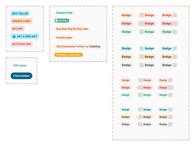
The inconsistency of Badge component
Initial problems
When I joined Tradeling, the design team was relatively large, with 11 designers and multiple products (most of which were later shut down and consolidated).
One of the biggest issues at that time was an imbalance in productivity between the design team and the frontend/backend teams, as they were not working at the same pace.
This resulted in more than 50% of the designers' work being left on the shelves and never picked up again, or only picked up a year later by another designer.
Additionally:
- Designers were using different components that lacked consistency.
- Multiple style and component libraries.
- No silngle source of truth.
- The process of giving and receiving feedback from peers and stakeholders was disorganized.
- A large number of components used colors not from the library.
- A large number of components did not pass the accessibility test.
Beginning
That's when my former colleague, Raj, stepped in and initiated Cargo (he joined 3 months before me). The idea was to consolidate all component libraries under one umbrella, and I joined right at the initial phase of Cargo's development.
Our work resulted in what Cargo is today, a well-done design system, that is a single source of truth for designers and developers.
As Figma continuously improves and introduces new features, including auto-layout, component variants, and tokens, I have maintained existing components to ensure they remain current and consistent.

Structure and processes
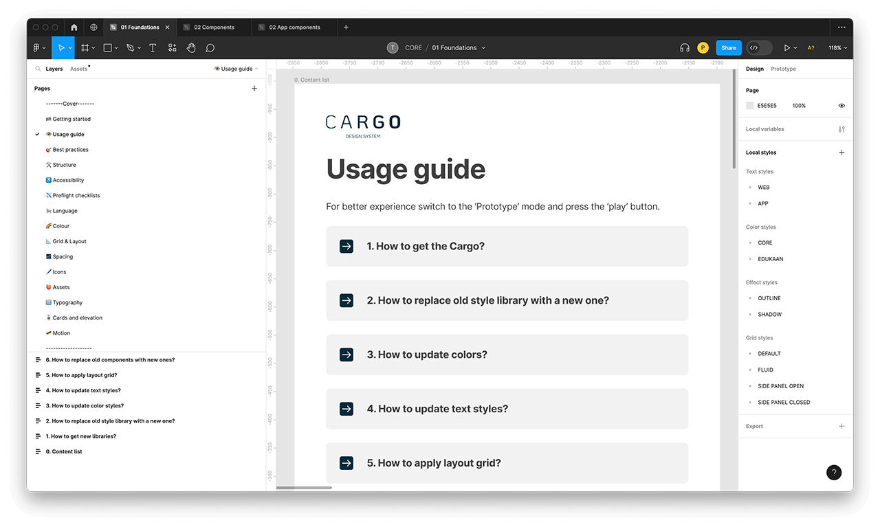
Before diving into the design process, one crucial aspect to consider is organizing files in Figma. Fortunately, when I started working, there were already established file and artboard naming conventions in place. Apart from this, we have defined the structure of Cargo, component documentation details, and the process the designer should undergo while creating a new component.
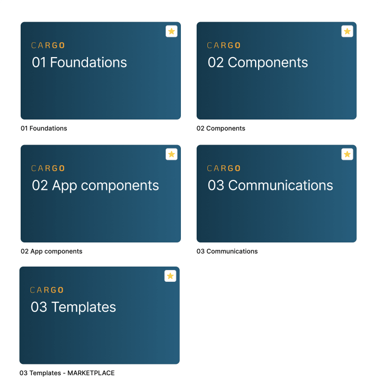
Organizing the library files of the Cargo Design System
File organization
As a design team, we agreed to use the next Figma file organization:
- Cargo Design System section in Figma contains all libraries.
- 01 Foundations — a base library, that contains colors, grids, fonts, icons, and guidelines that are connected and used by higher-level component libraries.
- 02 Components — a components library, that contains Atoms, Molecules, and Organisms for Desktop and Mobile Web platforms.
- 03 App Components — a components library, that contains Atoms, Molecules, and Organisms for the Mobile App platform.
- 04 Communications — a library that contains Email templates and SMS content used for communication.
- 03 Templates — a high-level library that contains pages such as PLP, CPL, Homepage, Search results, etc.
Component library structure
Cargo is built according to the atomic principles of Brad Frost.
First, it describes the fundamentals — Atoms, then it presents the components — Molecules. At higher levels, you will find the Organisms, Collections, and Templates.
Atoms
- Lowest level compositions. They do not contain nested compositions.
Molecules
- Molecules are simple compositions. They contain atoms but cannot contain other molecules.
Organisms
- Organisms are the most complex compositions as they can carry molecules.
Collections
- Collections split by purpose and theme, such as Cart, Checkout, and Account.
Templates
- Templates split by purpose and page, such as PDP, PLP, and SLP.
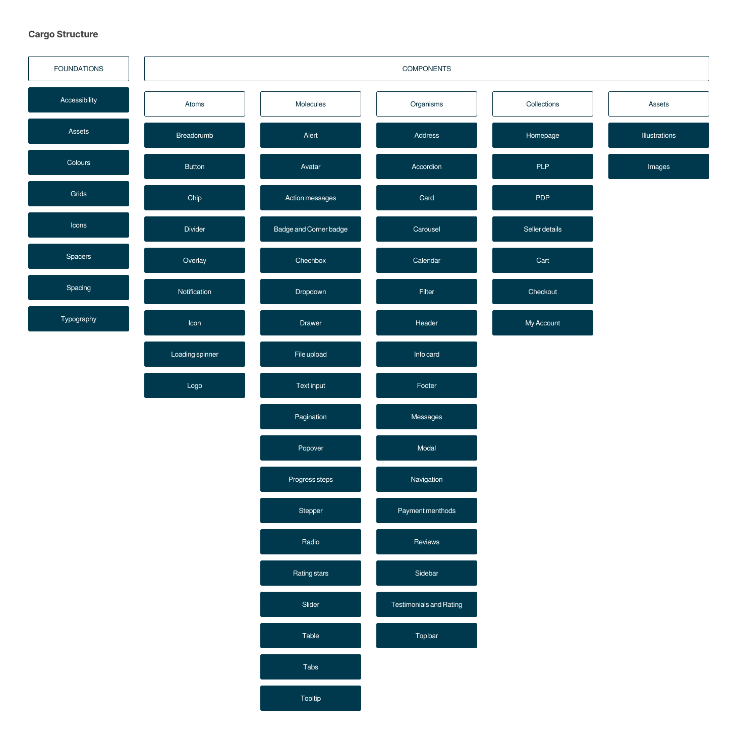
Atomic Structure of the Cargo design system
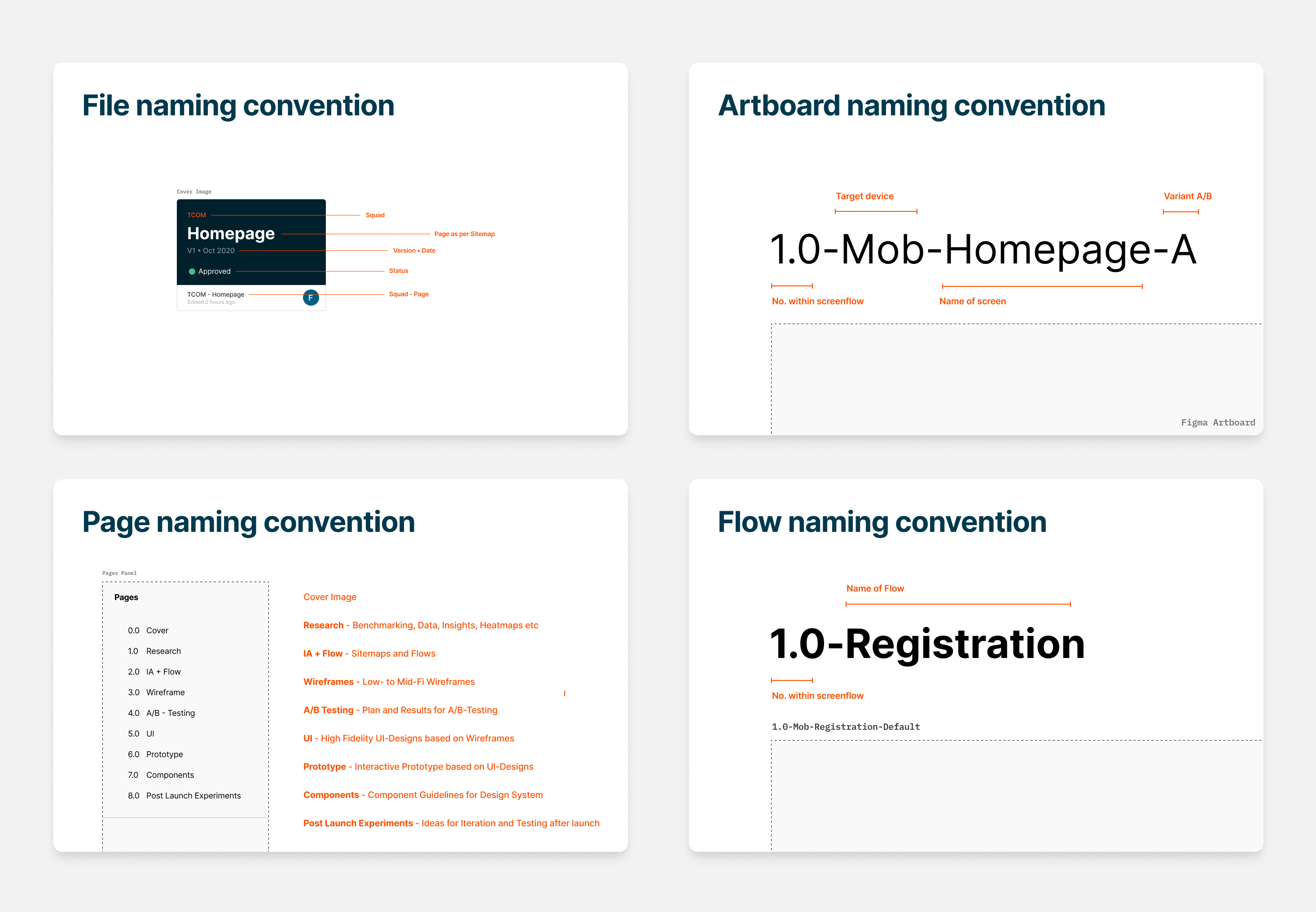
Figma naming convention examples
Naming conventions
Another amazing legacy item from Tradeling Design System is naming conventions for Figma files, artboards, pages, and flows. We also added 'sections' to this list.
Component documentation
When adding a new component to the library, it is recommended for the contributing designer to include all documentation related to the component, such as:
Usage
- What is it used for?
- When should it be used?
- Where is it being used?
Specs
- What is this component made of?
- Do we need to refer to other nested components?
- What are the different states? (default, hover, active, disabled)
- What are the different sizes?
- What are the different versions?
- What is the spacing between components?
- What are the rules around padding?
- What font styles are we using?
Behaviour
- What can the user interact with?
- What can the user not interact with?
- How does the component animate onto the screen?
- How does the component animate off the screen?
- Where do links point to? (if any)
Placement
- Where does the component sit in the layout of the page?
- Are there variation is placement depending on viewport?
Accessibility
- Does the text/background color contrast ratio pass the accessibility test?
- Are the sizings compatible with mobile?
Examples
- Add examples of component usage
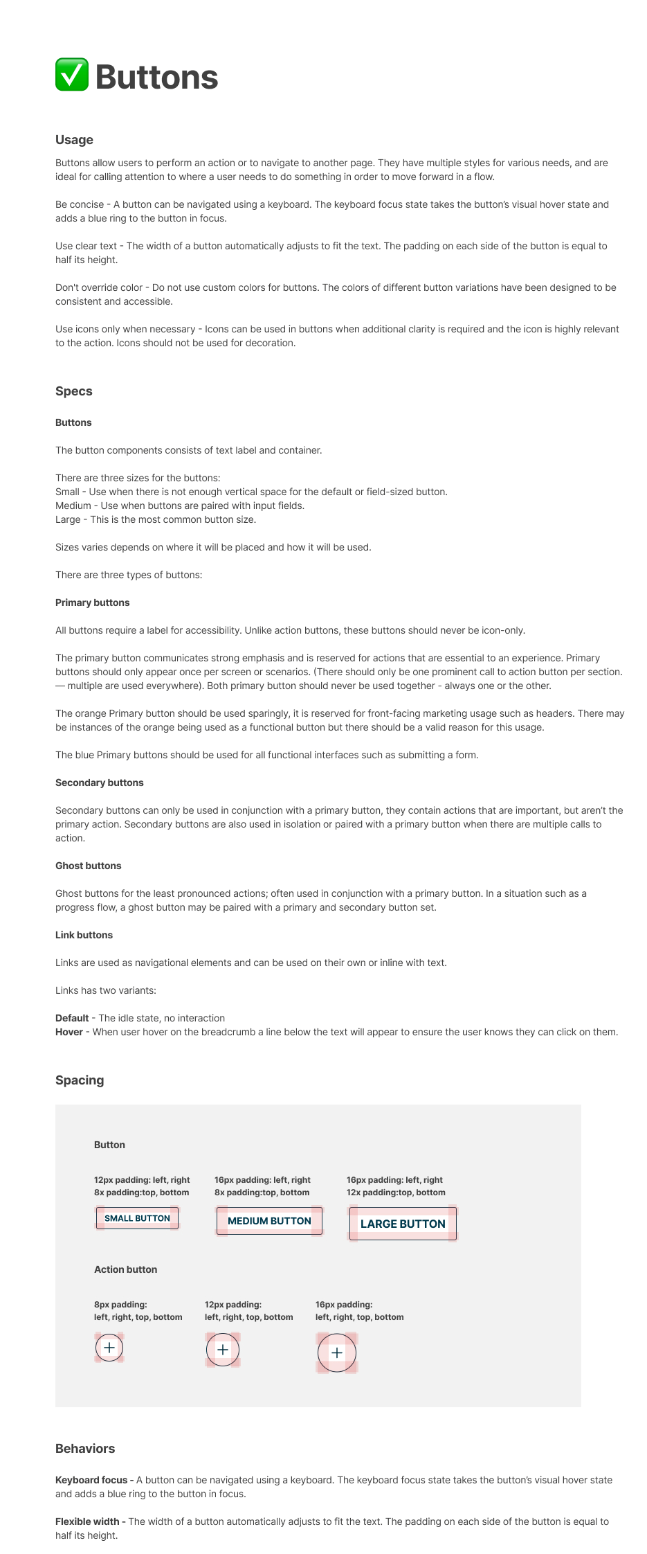
Button component documentation
Process of adding a component
When we are talking about the component library, UI designers that work on features may contribute Cargo and add previously non-existing components to the library. After that, the peer review takes place, where the whole design team reviews the components.
Design system stakeholders highly encourage other designers to use Cargo and the auto layout for their UI designs.
The process for the adding component is next:
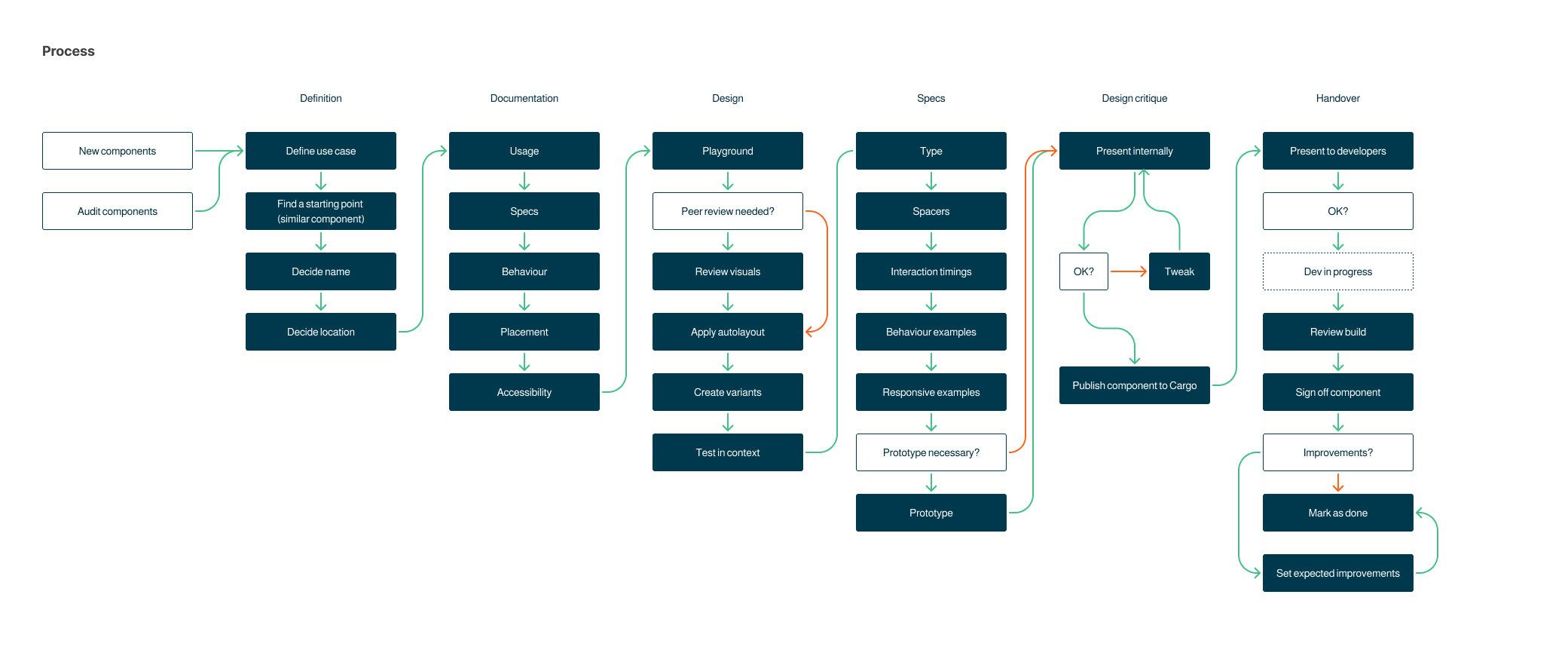
Process for adding a component to Cargo
Accessibility Check
I have noticed that color combinations in a large number of components do not have a proper contrast ratio. After inspection by the contrast check tool, this issue was confirmed across most design system components. To solve this issue, I've:
- manually went through each component and measured the contrast ratio with Figma plugin,
- added darker shades of colors to the design system style library.
- Updated the components, making sure all components pass the accessibility test.
- Informed colleagues about new accessibility standards.
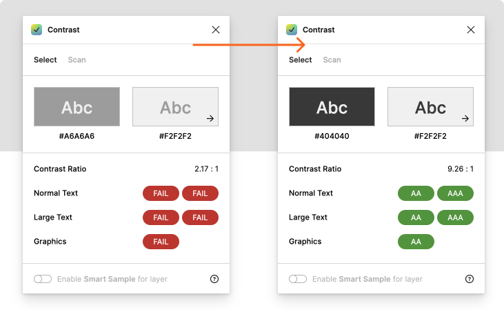
Using Contrast Figma plugin for contrast ratio check
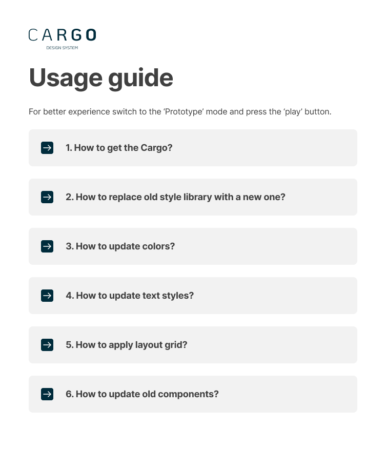
Cargo usage guide for designers
Cargo interactive usage guide
After the Foundation was built, we noticed some issues that we were not expecting:
- some of our designers didn't know how to connect Cargo to their UI's
- they kept using 'old school' hex codes for pasting colors
- created new text layers without using library font styles
- neglected using auto layout
- not using grids
For this scenario, I created the interactive illustrated usage guide in Figma and conducted an educational workshop for the designers.
It could be also used for onboarding new designers.
01 Foundations
Okay, lets start from the style library.

The 01 Foundation style library is a valuable resource for designers, as well as for front-end engineers. It consists of general information about the design system, usage guides, terminology, and styles, that are used in 02 Components and 02 App Components libraries.
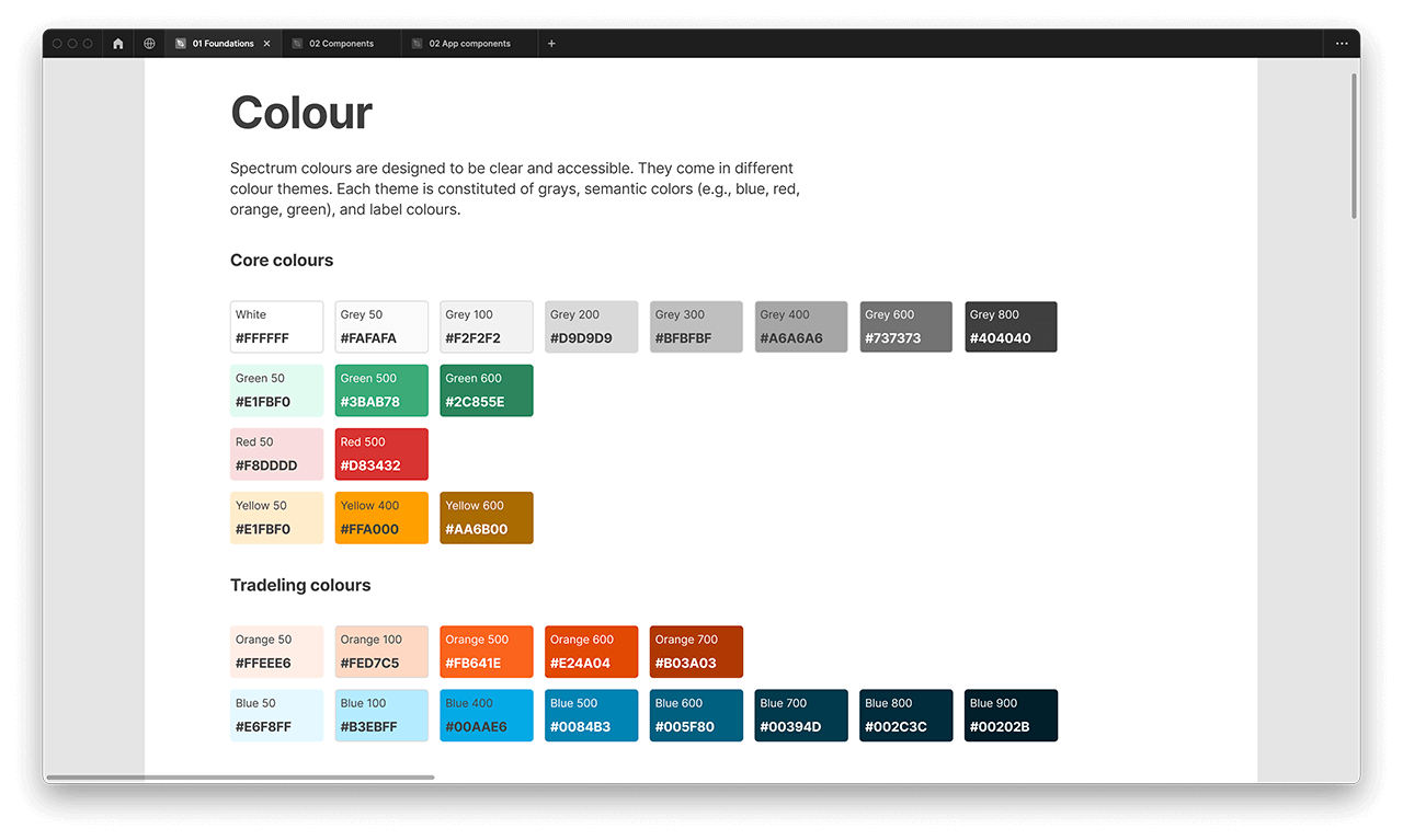
Cargo color styles illustrated
Colours
Spectrum colours are designed to be clear and accessible. They come in different colour themes. Each theme is constituted of grays, semantic colors (e.g., blue, red, orange, green), and label colours. The whole color section was revised and optimized, unused colors were removed.
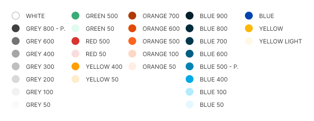
Color styles available from 01 Foundations library connected to all design files and component libraries.
Example of applying color style to the icon.
Typography
Tradeling is a bilingual platform that utilizes English and Arabic as its primary communication languages. To cater to both languages, we have developed corresponding font styles that are readily accessible from higher-level libraries and incorporated into all design files.
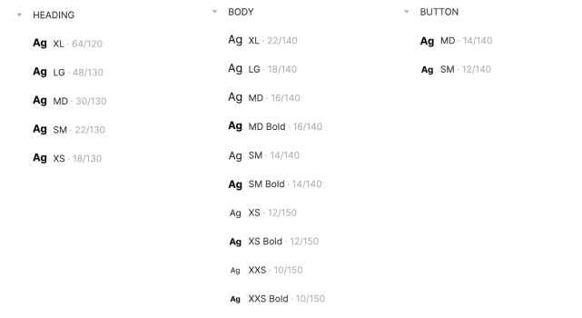
Practically, we skew toward the minimum number of typographic styles in our design – condensing as many styles as we can to reduce visual noise.
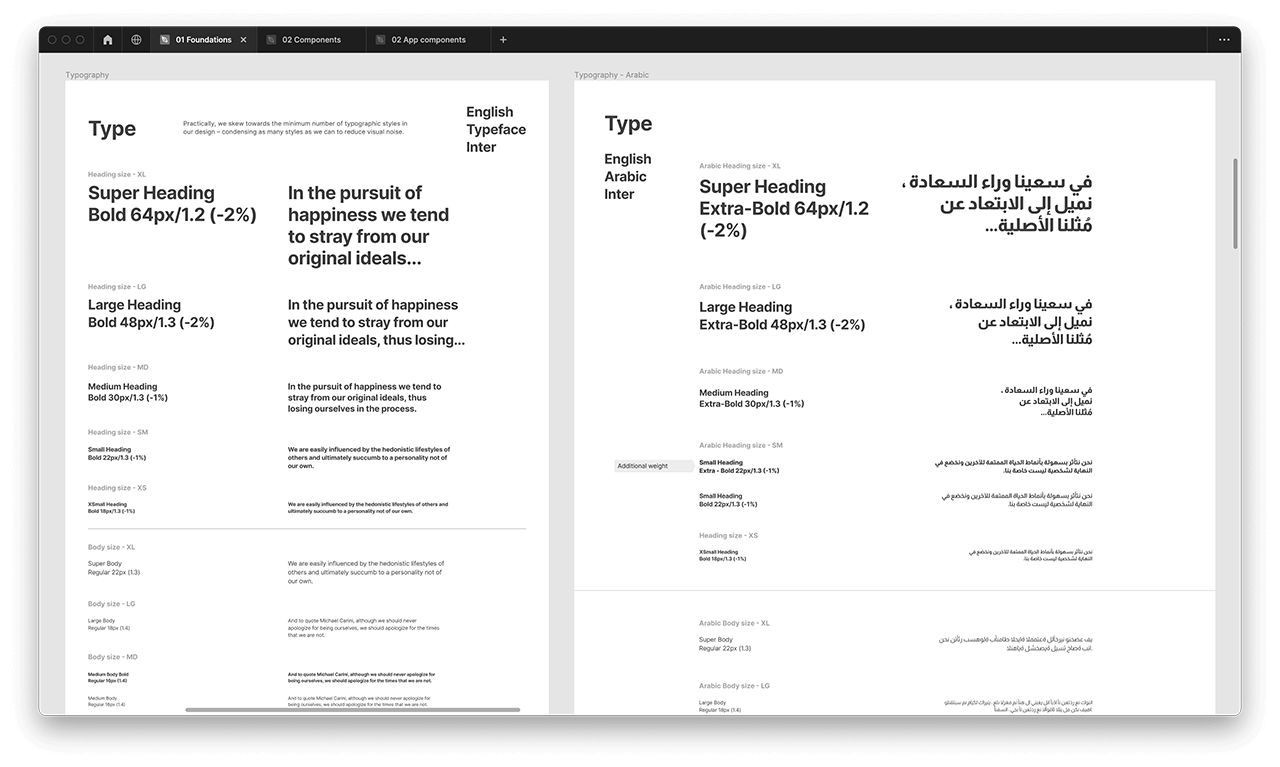
Example of bilingual (English & Arabic) font styles
Example of applying font style to the text layer.
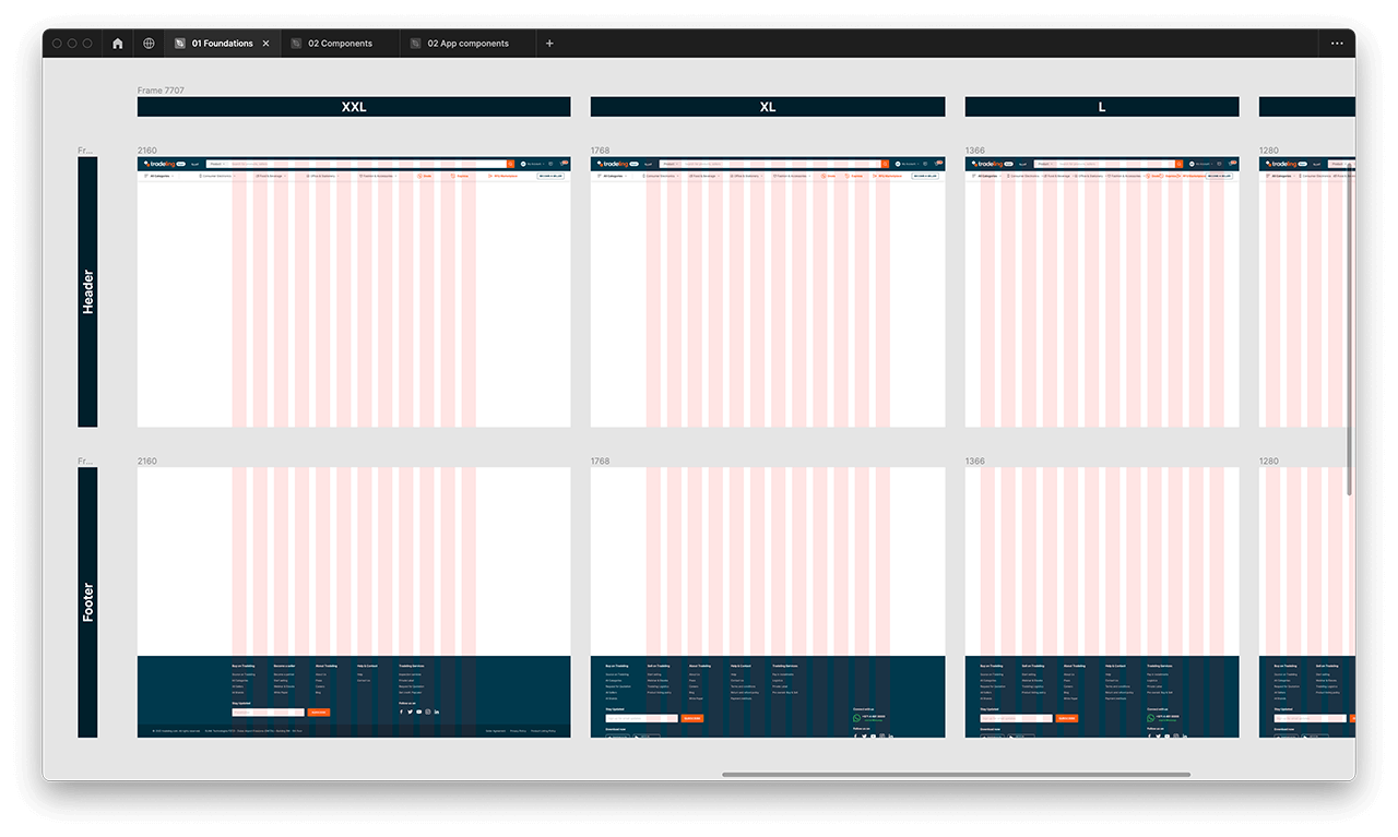
Cargo layout grid styles
Grids
Grids are essential for designing user interfaces for web and mobile platforms. They provide structure, alignment, and proportion, ensuring visual consistency and adaptability.
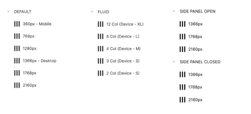
Grid-based designs promote efficiency, consistency, and hierarchical organization of information. They facilitate collaboration and help create user-friendly interfaces.
Spacings
A designer should use the spacing scale when building individual components. It includes small increments needed to create appropriate spatial relationships for detail-level designs. This scale is applied and used within all Cargo components. Examples are provided at component level.
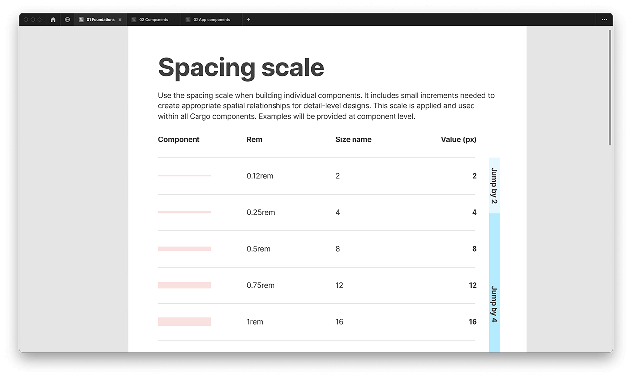
Example of Cargo spacing scale
Example of Cargo interface icons
Icons
While most icons are sourced from the predecessor, the Tradeling Design System, we have taken the initiative to manually update each icon, ensuring they are optimized for scaling purposes. Additionally, we have created any missing icons to maintain a comprehensive and consistent icon set.
Cards and elevations
A designer should use the spacing scale when building individual components. It includes small increments needed to create appropriate spatial relationships for detail-level designs. This scale is applied and used within all Cargo components. Examples are provided at component level.
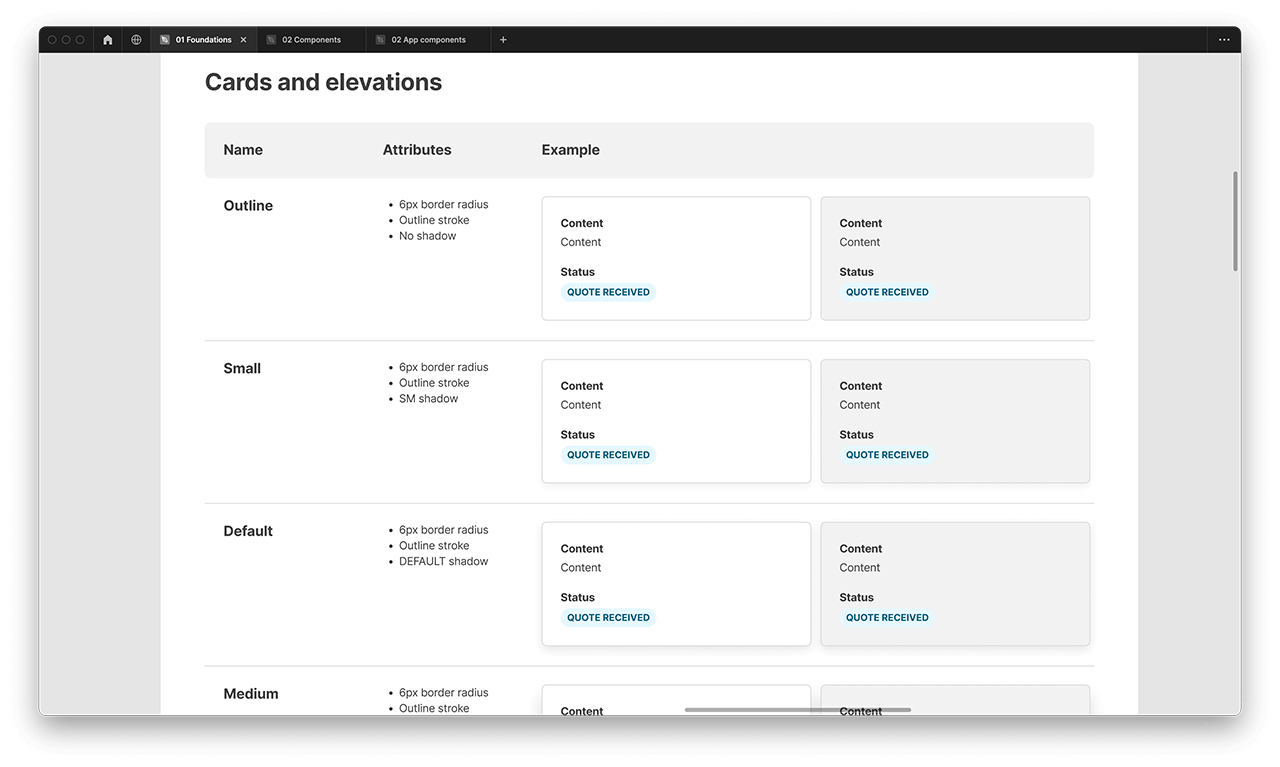
Cargo layout grid styles
More from the Foundations
Summary
The Foundations library serves as an invaluable and informative resource for designers and developers. It acts as the base style library, seamlessly integrated into every Figma design file and component library. However, the work is ongoing and there is still much to be done. Every aspect of Foundations has the potential to be expanded, improved, and documented in a more thorough manner.

02 Components
Now, we're approaching the exciting part where the UI magic happens. Firstly, I'll explain how components are categorized into groups, and then I'll showcase a few examples of components for each group.
In an atomic design system, the terms atoms, molecules, organisms, collections, and templates are used to categorize and organize the different components and elements of a Cargo design system. Here's a breakdown of each term:
1. Atoms
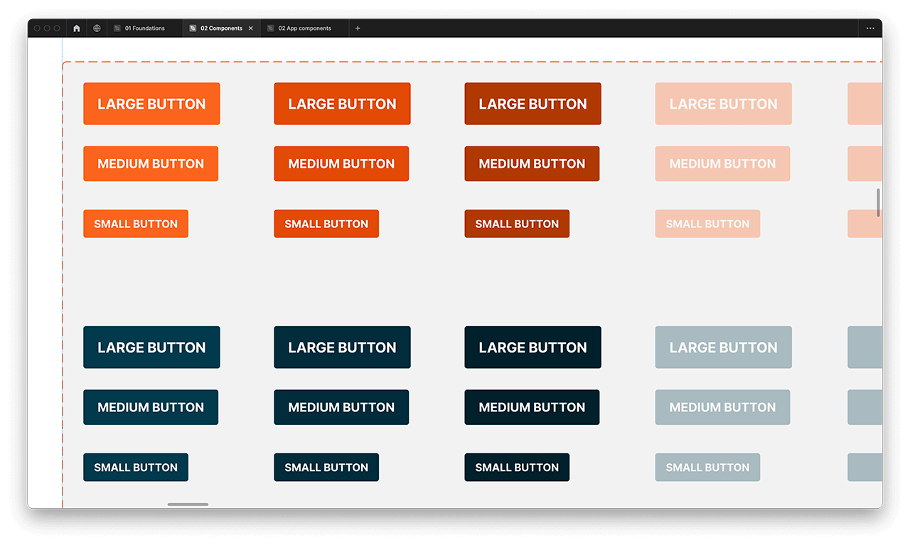
Atoms are the basic building blocks of a design system. They represent the smallest, most fundamental elements that cannot be broken down further. Examples of atoms include chips, buttons, overlays, etc. Atoms typically have minimal or no interactivity.
2. Molecules
Molecules are formed by combining multiple atoms together. They represent simple UI components that have a specific function and purpose.

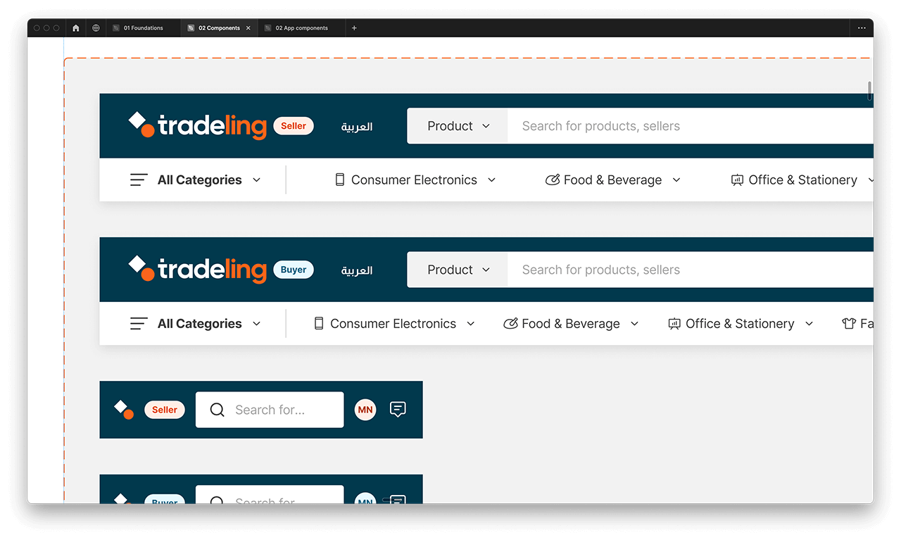
3. Organisms
Organisms are more complex components that are built by combining atoms and molecules. They represent distinct sections or modules of a user interface.
4. Collections
Collections in an atomic design system refer to grouped sets of related components, such as organisms or templates. They help organize components based on their purpose or theme, enabling efficient management and reuse.
5. Templates
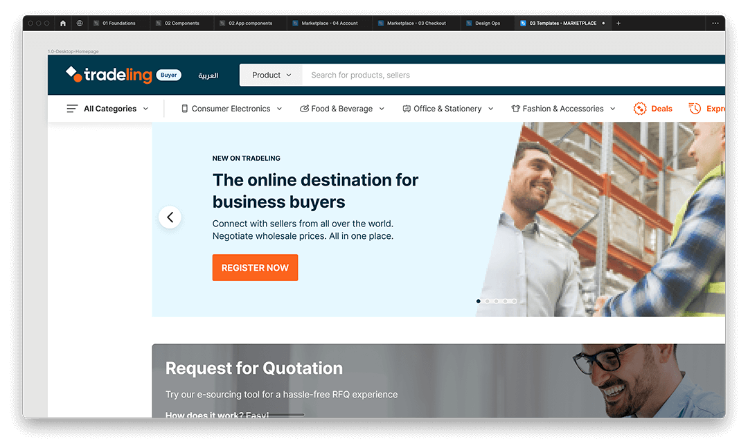
Templates are higher-level structures that provide a layout and arrangement for placing organisms and other components. They define the overall composition of a page or screen.
Atoms
Atoms are the basic building blocks of a design system. They represent the smallest, most fundamental elements that cannot be broken down further. Examples of atoms include chips, buttons, overlays, etc. Atoms typically have minimal or no interactivity.

Atoms component example: Buttons
Let's take Buttons as an example component from the Atoms category. Buttons allow users to perform an action or to navigate to another page.
They have multiple styles for various needs and are ideal for calling attention to where a user needs to do something in order to move forward in a flow. In addition to that, the buttons component has the best description and many variants.
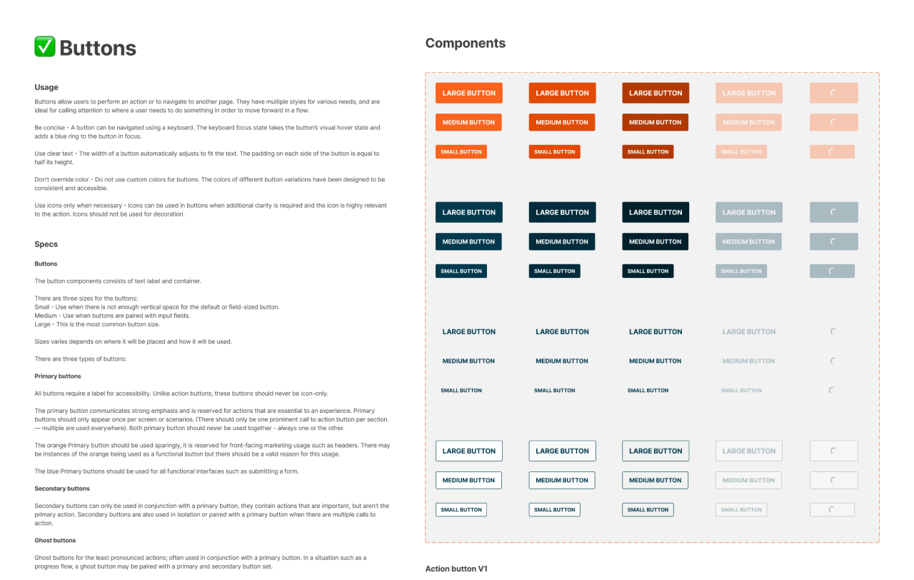
Buttons component detailed screenshot
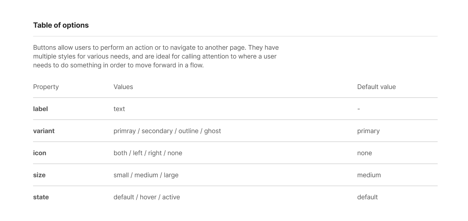
Buttons component table of options
Component options: Button
In order to be designer-friendly, a component must be flexible. Figma's component options feature enables us to make even a seemingly simple component adaptable enough to cater to the wide range of button and CTA (Call-to-Action) use cases throughout the Tradeling marketplace.
Example of editing button by using component options.
Molecules
Molecules can be thought of as groups of related atoms working together. Examples of molecules include a search bar (combining an input field, a button, and maybe an icon) or a dropdown menu (combining a button and a list).

Molecule component example: Alert
The Alert component is a common UI element used to notify users about important information, warnings, or alerts within an application or website. It serves as a visual cue to capture attention and communicate a specific message effectively.
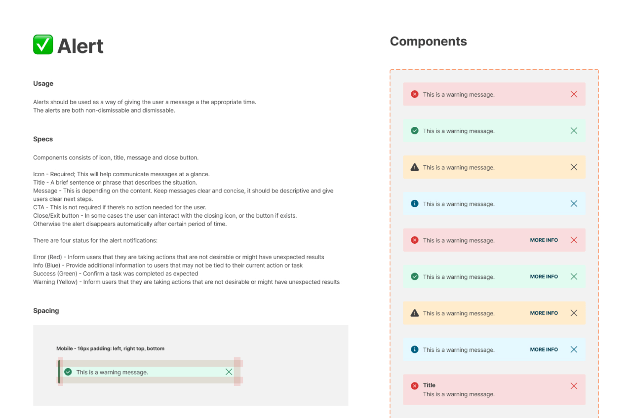
Alert component detailed screenshot
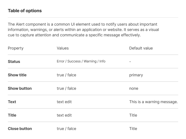
Alert component table of options
Component options: Alert
In order to be designer-friendly, a component must be flexible. The higher it gets in the components hierarchy, the more options are available.
Example of using alert by changing component options.
Organisms
Organisms are usually self-contained and can be reused across different templates. Examples of organisms include a header (combining a logo, navigation menu, and search bar) or a product card (combining an image, title, description, and buttons).

Organisms component example: Payment methods
The payment methods component is a versatile and comprehensive component that I have fully designed myself. It offers a wide range of payment solutions to cater to various user preferences and requirements.
It serves as a crucial part of the checkout or payment process within an application or website. Its primary purpose is to allow users to select their preferred method of payment securely and conveniently.
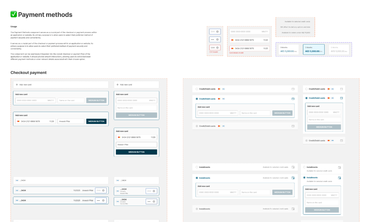
Payment methods component detailed screenshot
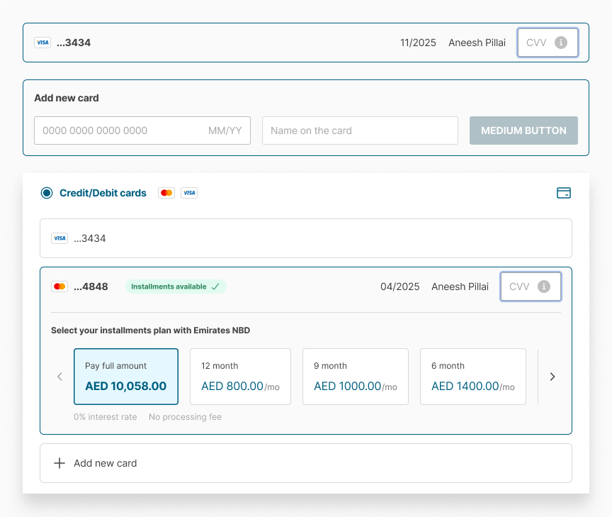
Payment methods - a multi-level component
Multi-level component
The Payment methods component can be seamlessly integrated into the overall checkout or payment flow of the application or website.
This organism-level component consists of several other organisms.
It should provide smooth interactions, allowing users to switch between different payment methods or enter relevant details associated with their chosen option.
Example of using Payment methods component.
Collections
Collections in an atomic design system refer to grouped sets of related components, such as organisms or templates. They help organize components based on their purpose or theme, enabling efficient management and reuse.

Collections component example: PDP
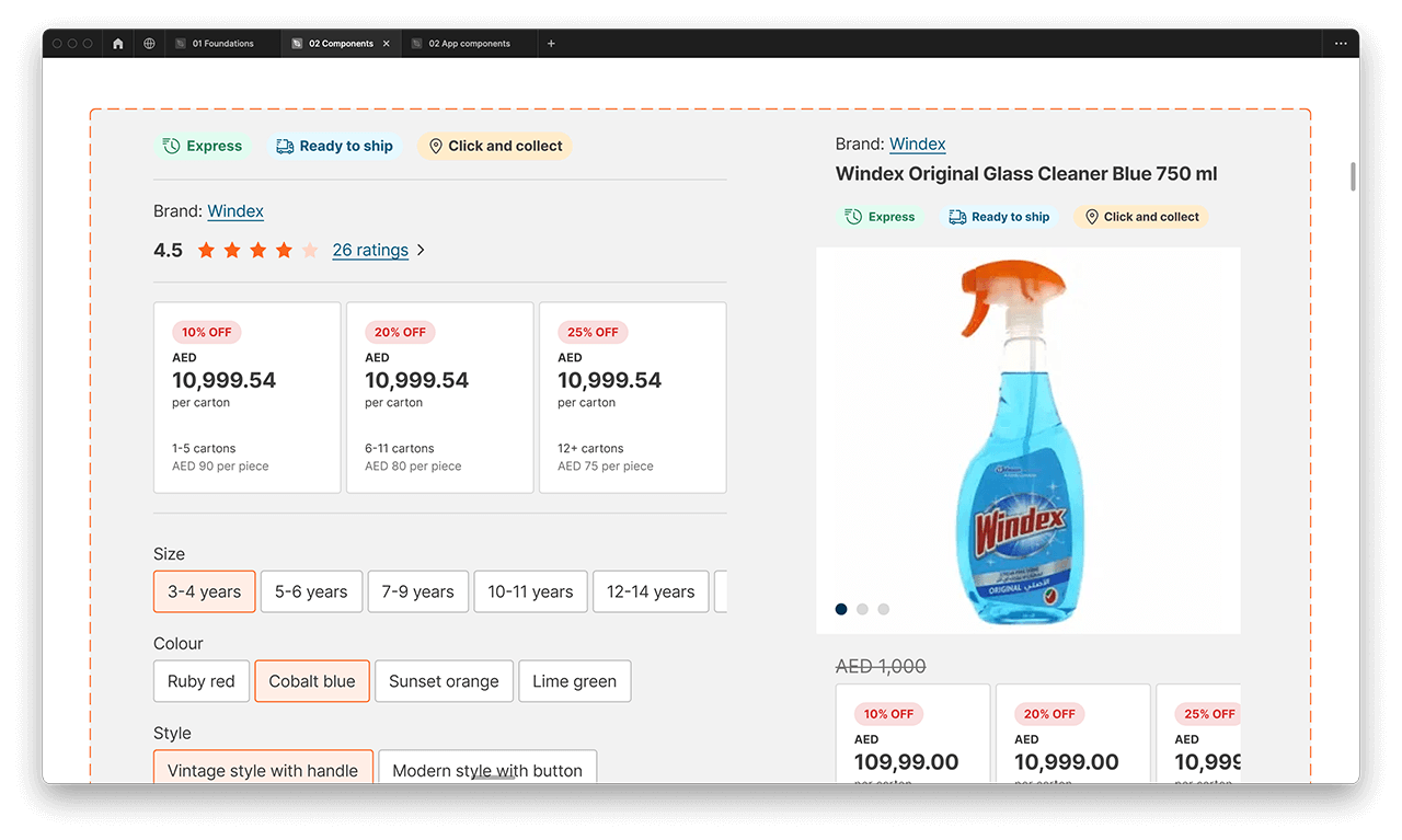
The product description page (PDP) holds immense significance within the e-commerce marketplace as it plays a vital role in the purchasing process.
In fact, approximately 90% of all purchases are initiated and completed through the product details page.
This emphasizes the critical role the PDP plays in influencing customer decisions and facilitating successful transactions.
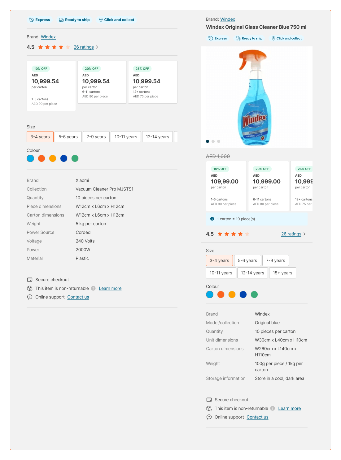
PDP components collection detailed screenshot
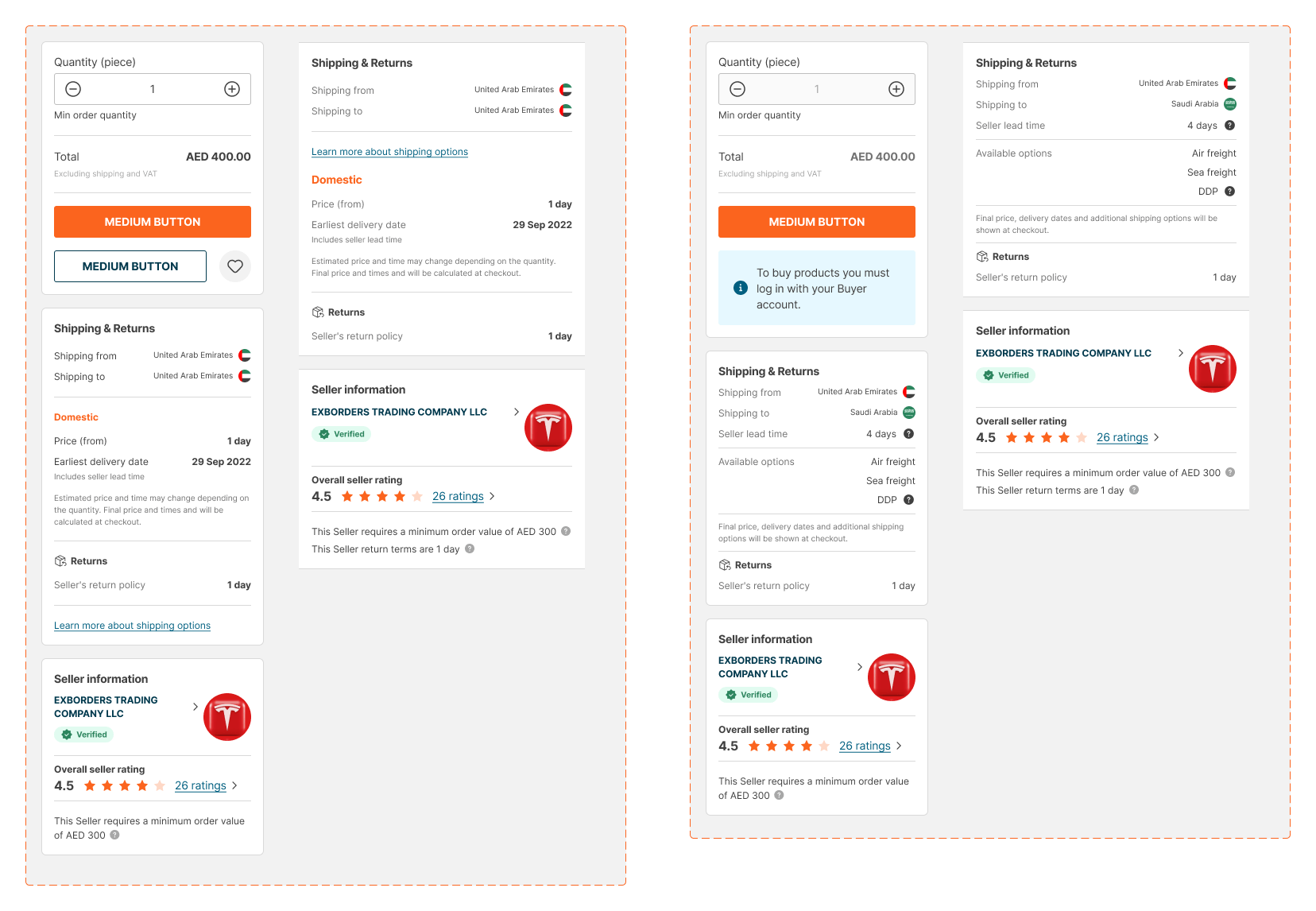
DPD details
Information containers
Every piece of information on Product Description Page is equally important and should be converted to a component with variants. This way we ensure consistency throughout the platform and provide a valuable resource for frontend developers on different states of the components.
Templates
Templates are used to create consistent page structures and establish visual hierarchy. They often include placeholders for dynamic content and can be customized for different contexts.

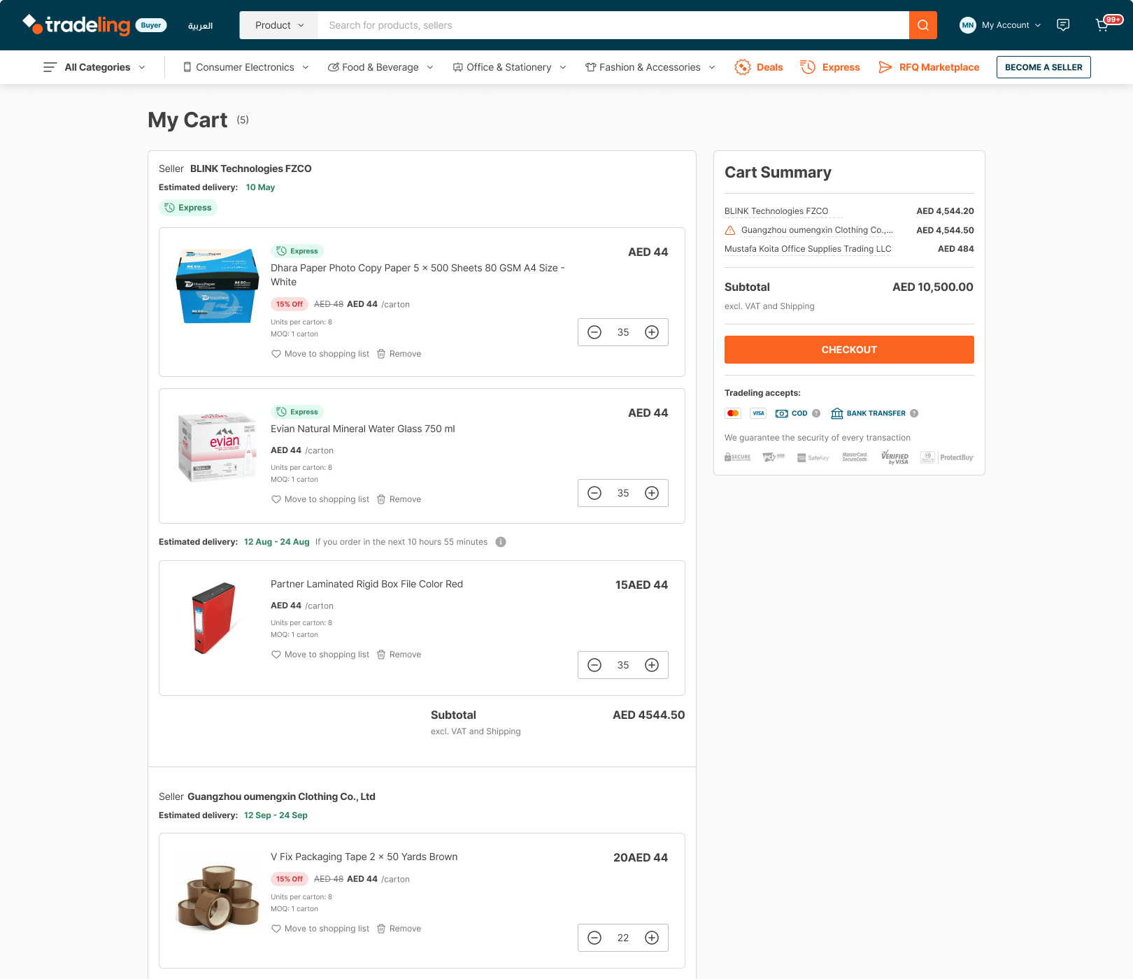
Templates component example: Cart
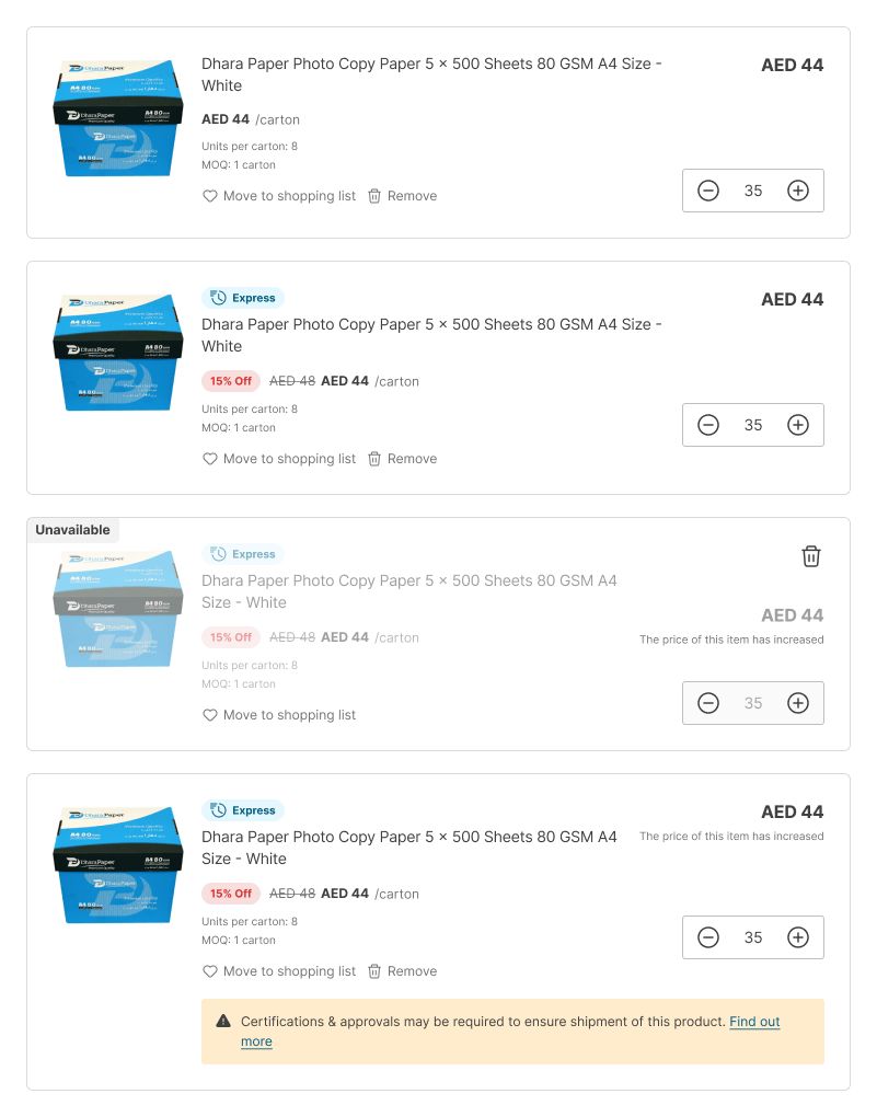
The shopping cart is a pivotal element in the purchase flow for both B2B and B2C marketplaces. It provides buyers with the flexibility to adjust the quantity of each product, remove unwanted items, and even add products from their 'Saved products'.
The cart stage empowers customers to review and modify their orders before proceeding to checkout, ensuring a seamless and personalized shopping experience.
Alert component detailed screenshot
Payment methods - a multi-level component
Sub-components
Cart sub-components, such as the product card, play a crucial role in shaping the overall purchase experience. These elements are essential in providing a comprehensive design experience and proving valuable references for front-end developers during the development phase.
By incorporating various states of the product cart, designers and developers can ensure a more refined and user-friendly interface, ultimately enhancing the overall shopping journey for buyers.

03 Frontend
I've been using Google Analytics for over 10 years on my personal websites and blogs, which has given me a strong understanding of what constitutes a well-performing website.
However, when I joined Tradeling.com, I immediately noticed and raised concerns about the website's poor loading speed and overall performance, making it nearly unusable.
Tradeling's mobile web platform scored a disappointing 14 out of 100 on Google PageSpeed Insights, while the desktop performance was slightly better at around 33 out of 100.
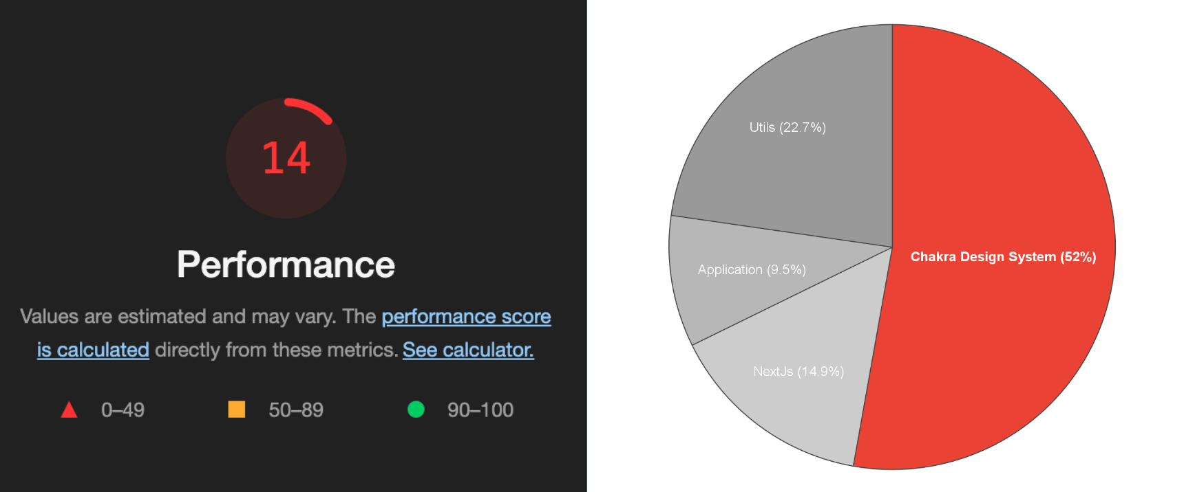
The main issue behind these problems was the excessive code and style libraries. To address these performance issues, we decided to implement the Cargo design system and reached an agreement with the frontend team to take action.
As a result, we made the decision to replace Chakra UI with Tailwind CSS. The frontend team demonstrated that by utilizing Tailwind, we could optimize performance by at least 20 times, significantly reducing the bundle size.
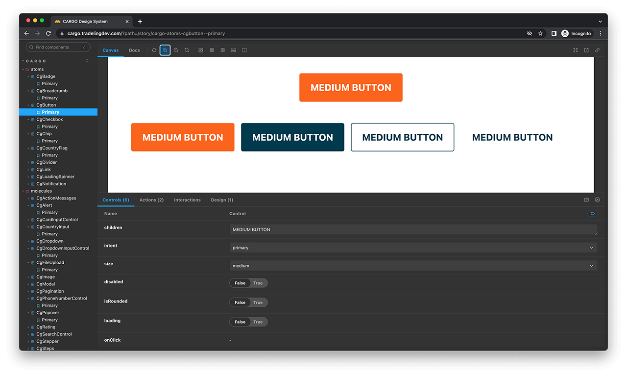
Tailwind CSS powered Cargo design system
By adopting Tailwind CSS and implementing the Cargo design system, we aimed to tackle the performance challenges caused by our previous reliance on Chakra UI.
Our ultimate goal was to provide users with a faster and more efficient website experience, and the introduction of the new Cargo frontend library successfully achieved that objective.

Final thoughts
I would like to acknowledge Raj Mohanlal for initiating Cargo and Ritz Gutierrez for her contributions and maintenance of the mobile App component library. Also big thanks to Guillaume Milon and Tradeling's design and frontend teams.
Although we have made significant progress, there is still a long road ahead to recreate all components using Tailwind CSS and fully launch it on the marketplace.
Stay tuned for further updates and developments as we continue our journey toward an ultimate Cargo Design System.
Results
- The speed of UI creation doubled.*
- The speed of implementing changes to UI designs doubled.*
- The frontend handover speed increased by 1.5 to 2 times.
- The number of high-level components grew from 20 to over 50 for the Web and over 50 for the App.
- Website performance with Cargo partially running improved by 20% so far. By the time Cargo will be fully implemented, a 100% performance increase is planned.
*UI based on the prototypes made from existing components. Figma features such as Autolayout, Find and Replace, Components variants, etc. had a massive impact on design productivity as well.
Thank you for reading my case study on the Cargo design system. Hope you enjoyed it!
